Mobile-first decisions
We begin with the smallest screen so the most important information and actions never become an afterthought.
Plan a mobile-first siteCustomers move between phones, tablets, laptops, and large screens without thinking about it. Sylerity designs one flexible experience that stays clear, comfortable, and easy to use wherever the website is viewed.
One website experience, carefully considered from the smallest screen up.
Flexible layouts, thoughtful priorities, and practical testing keep the website useful from a phone in hand to a desktop in the office.
We begin with the smallest screen so the most important information and actions never become an afterthought.
Plan a mobile-first siteContent, images, navigation, and spacing adapt smoothly instead of simply shrinking into a tighter space.
Improve every screenThe experience remains recognizable, readable, and comfortable to use across common devices and screen sizes.
Review your current siteResponsive design protects clarity and usability as customers move between phones, tablets, and desktops.
We identify the pages, actions, content, and devices that matter most to customers.
Content hierarchy and key actions stay clear even when space becomes limited.
Components, images, navigation, and typography respond naturally to changing screen sizes.
Hands-on review confirms readability, speed, accessibility, and comfortable interaction.
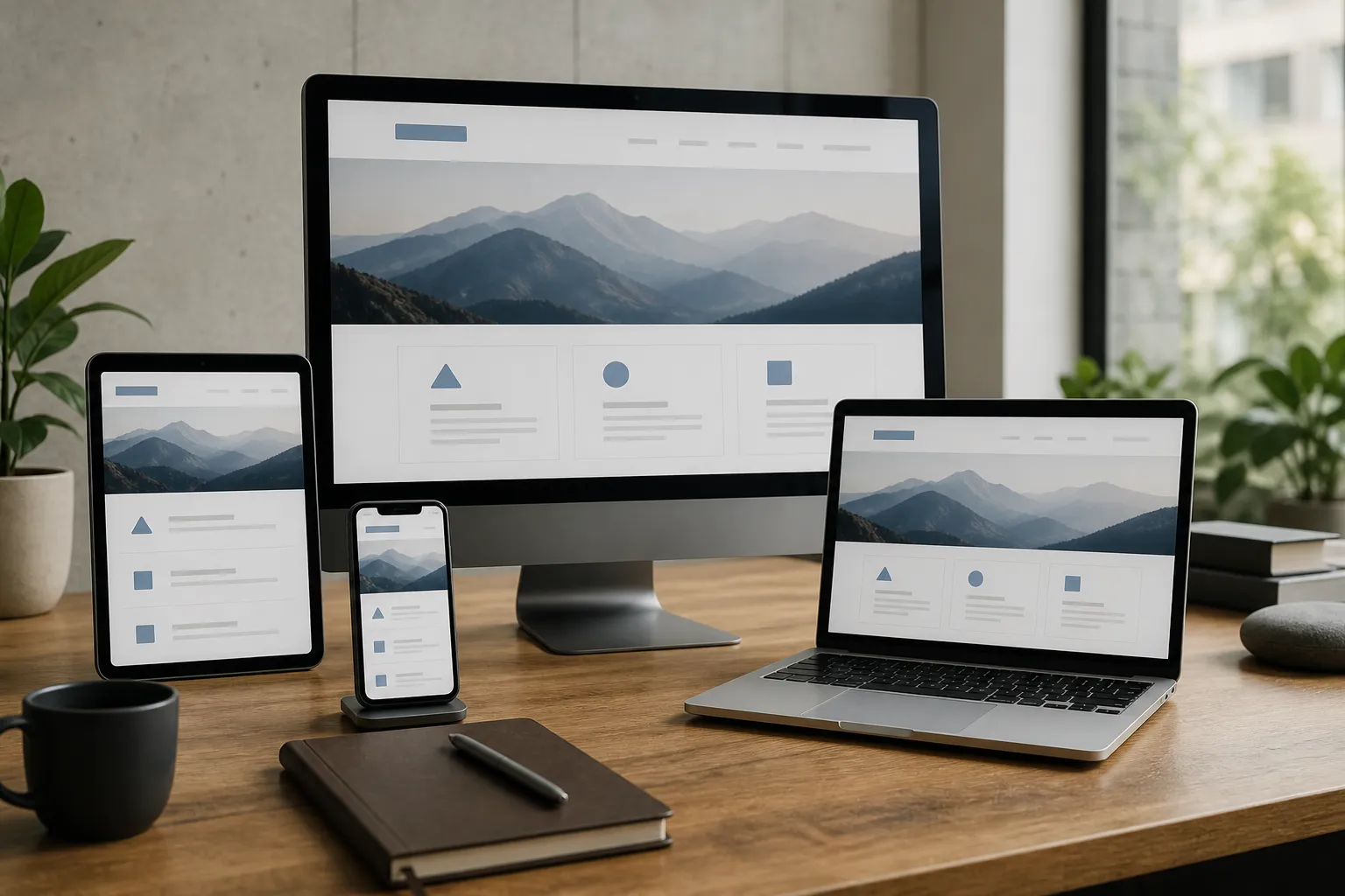
Responsive design is more than making a desktop page smaller. We reconsider priority, spacing, navigation, images, and actions at each screen size so customers get the right experience without pinching, hunting, or waiting.
We will review how the site behaves across devices and recommend the clearest path to a truly responsive experience.